TIMELINE
Jan 2021 - Jan 2022
PLATFORMS
Fire TV, Roku, Apple TV, Google TV,
Samsung, Vizio, WebOS
MY ROLE
Senior Product Designer
Introduction
CMG has been at the forefront of local news Connected TV offerings, being among the earliest to launch apps on these platforms. These apps, branded for each of CMG's television stations, have become increasingly crucial in delivering CMG’s content to its user base. Over the years, multiple redesigns have been implemented to stay current with evolving media and design trends.
My Role
I was the lead product designer for this project. I collaborated with the Director of Product & Innovation (Alex Prestel) on some early concepts, the CTV product manager (Saru Palanivel), as well as Cox Custom Research, and engineers for a variety of CTV platforms.
Problem
Though redesigned a couple of years prior, the app required a complete overhaul to meet the company's needs. Below are the key issues we identified.
Evolving Content Strategy
ISSUE
The UI, initially designed for a VOD model with up to two live streams, could not support the company's new strategy centered around an expanded catalog of 6-20+ live streams.
IMPACT
Layout and navigation constraints prevent the effective display and management of additional live streams, compromising the visibility and accessibility of relevant stream and show information.
Hidden Content
ISSUE
While browsing content, live streams are only depicted as text menu items, with VOD thumbnails hidden under menu categories.
IMPACT
The lack of immediate visual content presentation hinders user engagement and discovery, resulting in a less intuitive and appealing browsing experience.
Unintuitive Navigation
ISSUE
The navigation is unintuitive, with interactions that do not follow expected patterns. For example, to access a category's content from the left menu, users must press right (which focuses the video player) and then down to reach the associated content.
IMPACT
This frustrates users, leading to decreased engagement and a higher likelihood of users abandoning the platform due to poor user experience.
Goals
Business Goals
Promote Live Streaming
Shift user focus from VOD to live streaming, leveraging higher CPM rates.
Enhance Product Value
Deliver a more consistent and seamless user experience across all products, reinforcing their core value.
Increase Flexibility
Develop a more scalable and adaptable UI framework; enabling feature and content growth with simpler yet more controlled theming and customization.
Boost Sponsorship Opportunities
Create new avenues for sponsorship and advertising within the platform.
User Goals
Intuitive Navigation
Implement navigation patterns that are more familiar and intuitive, ensuring that interactions align with user expectations and enhance usability.
Content Focused Layout
Prioritize the display of content to improve discovery and create a more visually appealing interface.
Informative Content
Provide users with valuable information such schedules and show details.
Modern Design
Update the UI to reflect a more contemporary aesthetic.
Impact

Process
Discovery
Market Research
Cox Custom Research examined local news preferences and content delivery methods, identifying barriers to digital adoption within the Atlanta market.
Competitive Analysis: Local News Apps
I analyzed several local news CTV apps, benchmarking our existing app against competitors in terms of features and capabilities, content offerings, ad presence, UI layout and interactions, and overall user experience.
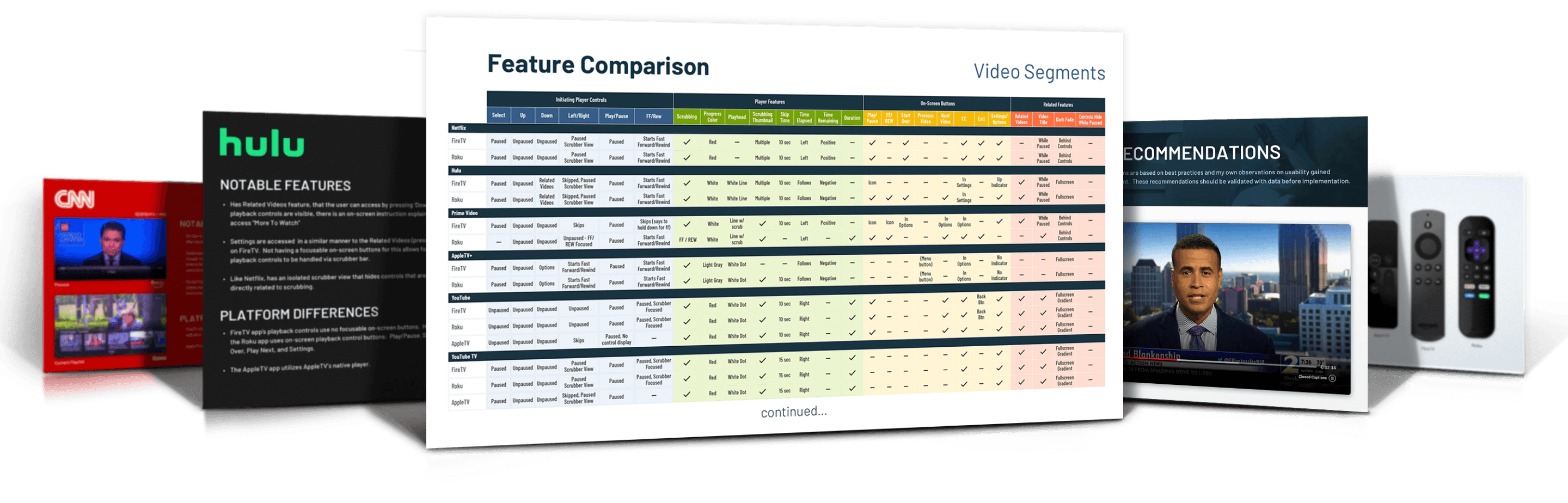
Competitive Analysis: Video Player Controls
I had previously conducted a comprehensive analysis of CTV video player controls, focusing on livestream, video-on-demand, and ad display controls. The evaluation included local and national news apps, as well as major streaming services like Netflix and YouTube, across multiple CTV platforms. Key focus areas included control layout and interactions, features, and consistency across different content types and devices.
Explorations
I began by wire-framing basic frameworks for the app, as well as some sub-sections, like weather and settings.
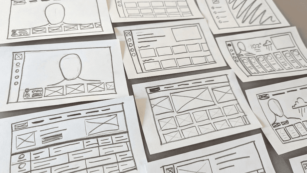
We settled on three frameworks to explore a bit further:
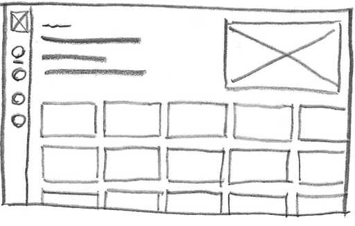
Netflix-style content discovery, featuring category rows of thumbnails. Potential for visually engaging content
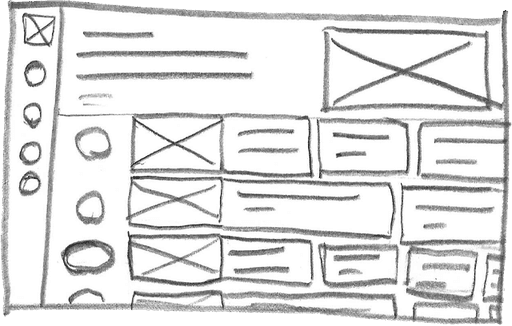
Cable-style episode guide layout. Provides more information, namely about future programming.
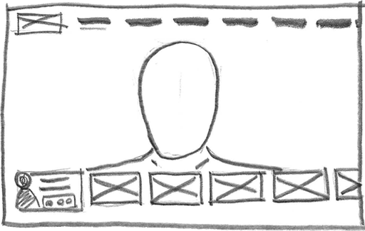
Video-centered. Video always full screen, with the interface & content overlaying it when surfaced.
Prototyping, Testing, Iterating
Next, I did some simple prototyping of each. And while #3 felt really clean and sleek, it fell short on addressing some of the key goals of the project, namely improving content discovery, so it was scrapped going forward.
Prototype #1
Prototype #2
Prototype #3
Product Study
Cox Custom Research did an online survey of 1500 respondents (Atlanta & National) who were shown two prototypes to assess user preference on the two major content discovery frameworks under consideration. They also conducted focus groups on streaming content offerings to be incorporated in the finished product.
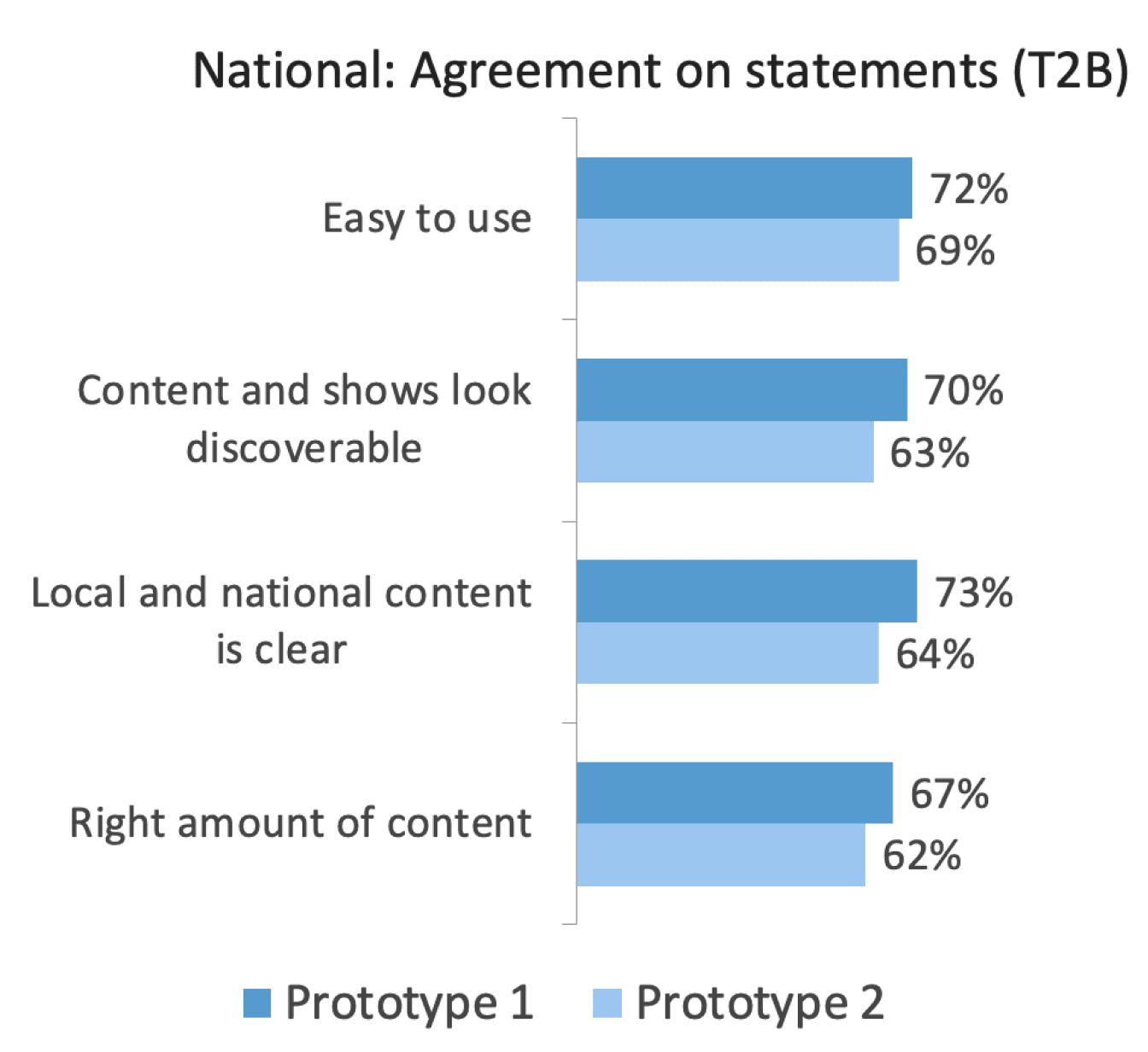
While 2/3rds of respondents preferred Prototype 1 over Prototype 2, the latter still performed very well in the study. Given its overall performance, and the capacity of that content model for future enhancements (eg. schedules, reminders, notifications), the product manager decided that a similar schedule view would later be phased in as an alternate method of discovery within an app built around Prototype 1.
User Flows & Usability Testing
Next, I fleshed out designs for major sections with user flows, task flows and comps and expanded and refined prototypes. I did some guerrilla usability-testing with some prototypes on my laptop, with a FireTV remote paired and mapped to it, iterating based on user feedback.
CHARACTER COUNTS
I frequently receive requests to define character count limits due to spatial limitations in our products. I’ve found that prescribing character counts is far too blunt an instrument, so I repurposed some of my prototype components, and created a tool in Framer to allow producers to preview how text will fit within the UI.
Final Designs
Below are the final designs. The app was released across different platforms at different times, with varying features at launch.
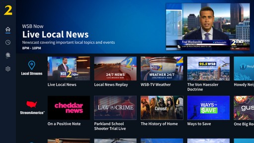
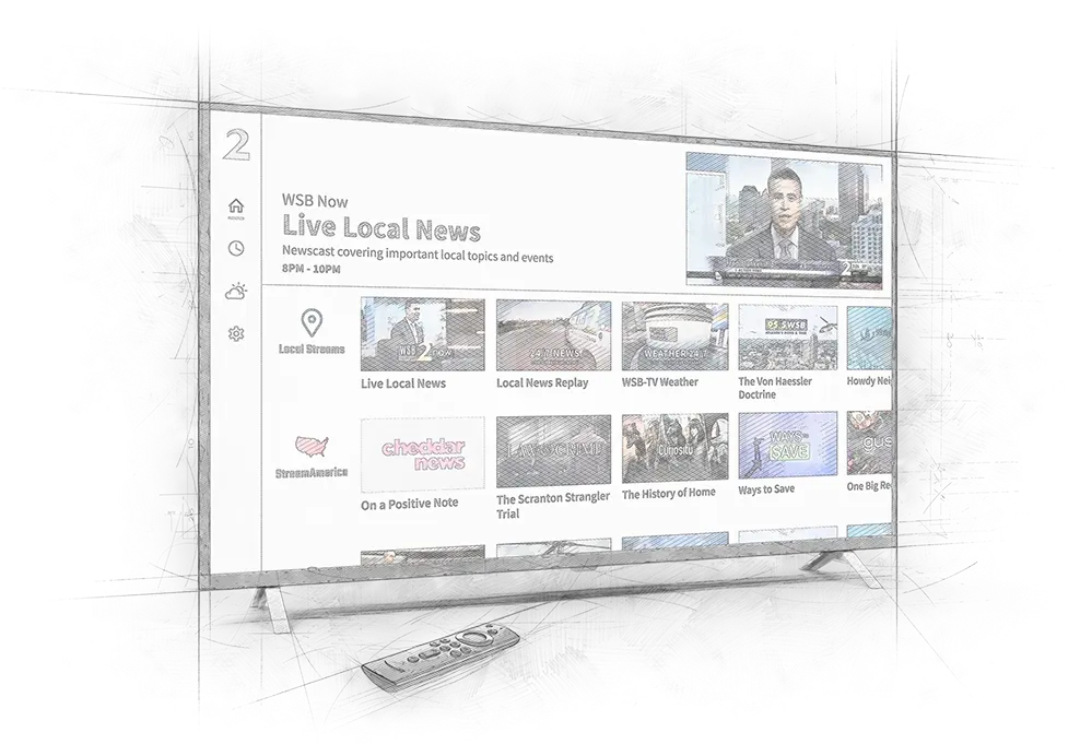
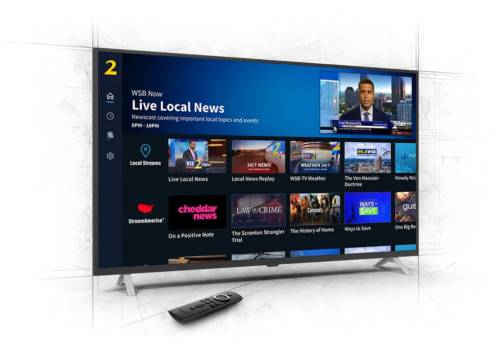
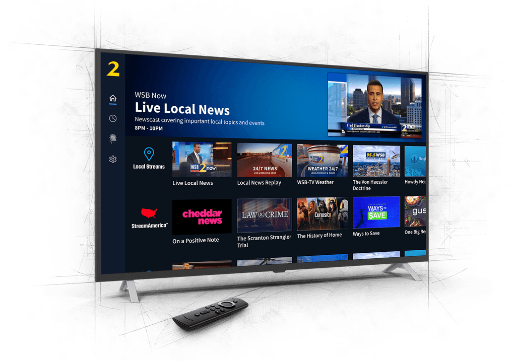
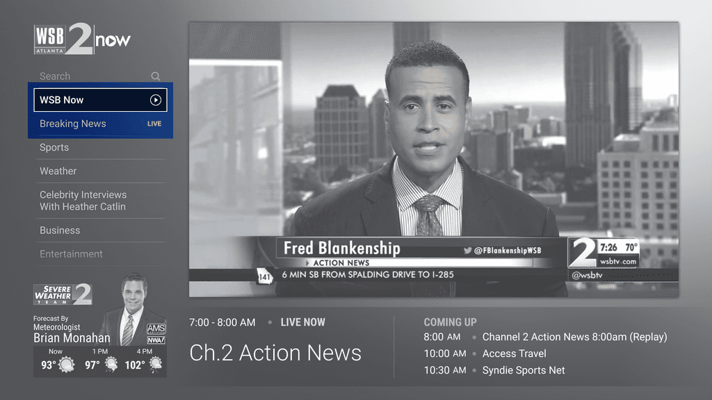
Home
To maximize available vertical space for content, we placed category titles in-line. The thumbnails themselves are intended to be dynamic, which would be phased in once our content server was able to incorporate the ability. Until then, stream names are incorporated into the images, with show titles below.
Schedule
The value of a schedule page in providing the ability to see what shows are coming up and plan accordingly was apparent from the research study. A recent migration to a new video service platform that wasn’t yet equipped to handle a significant portion of what we wanted to include and designed for, limited what we would be able to launch in Phase 1:
Incapable of determining if content is truly "Live"
Limited EPG metadata
Unable to start a show from the beginning if joining the stream late
Incapable of displaying dynamic thumbnails
Weather
CMG's research has consistently shown the brand value of their stations' meteorologists and the strong audience connections they've fostered. Recognizing this, incorporating meteorologists into the UI has been a long-standing priority. To ensure cross-platform consistency, we adapted common weather components from our mobile apps and web.
Video Player Controls
As previously mentioned, a recent migration to a new video service platform severely limited some features, which had a significant effect on functionality available for our video player controls, such as an inability to watch from beginning of show if starting stream at later point, or the inability to use a scrubber bar on livestreams.
The actually implemented controls have a bit more variation by platform; for example, on AppleTV, native platform player controls are used.
Reflections
Overall, I believe this product was a major a success, and I’m very proud of the role I played in its launch.
There were quite a few limitations – temporal, technological, and content – that significantly limited what we were able to accomplish relative to our overall vision, but the progress on phasing in the major features has resulted in a product that has exceeded the original goals laid out, with much room to grow.